Goal
This e-commerce app home screen acted as a catalogue for the products available to order.
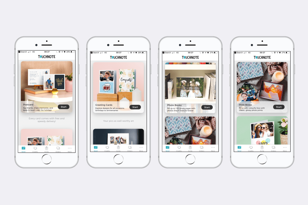
It needed a refresh – as the range of products had expanded, the existing format didn’t work to showcase them well. Each product in the range had a card with just an image of the product, its name, and a button to order. There was no further product information. You had to scroll horizontally between products rather than vertically.
We wanted to encourage users to explore the product range and increase conversions.
Challenges
The stakeholder had a hard time letting go of the horizontal swipe through the product catalogue as it “made us different from the competition”. But using data from AppSee we were able to show that users were continuously trying to scroll vertically, not horizontally, and that it was not intuitive.
In addition to this, due to the increasing popularity of dating apps, some users will associate the act of swiping left or right on a card with approving or removing it, rather than scrolling.
Approach
I worked with a UI designer and the product manager to create a new home screen with a vertical scroll composed of cards that could be added and removed as the product catalogue grows.
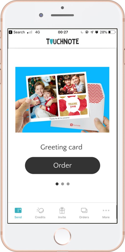
I added descriptions for each product that would convey their use case and created a consistent approach to the way each description and button were written.
I chose the CTA “Start” to set the expectation that there were more steps to follow (and customise their product). Each product had a different journey to follow from the home screen, so “Start” covered all of the scenarios.
I worked with the Head of Design to commission new product photography that reflected the use cases what I had written.
Outcome
We increased conversions and also the length of time spent by users on exploring the full range on the home screen.